CSS Flexbox
by Fossery Tech
Download (.odt) Download (Markdown)A CSS feature to position multiple items inside a container (parent) along main axis (along which items are laid out, horizontal by default) and cross axis (vertical by default).
Parent element has the following rule set:
div {
display: flex;
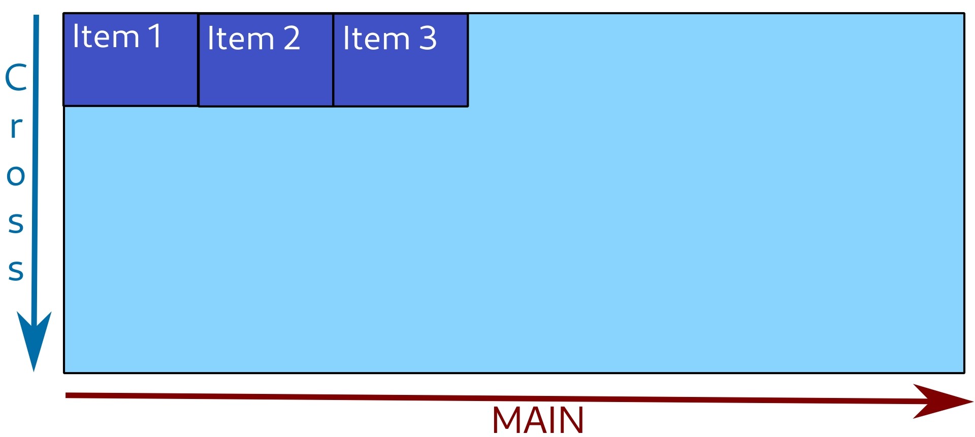
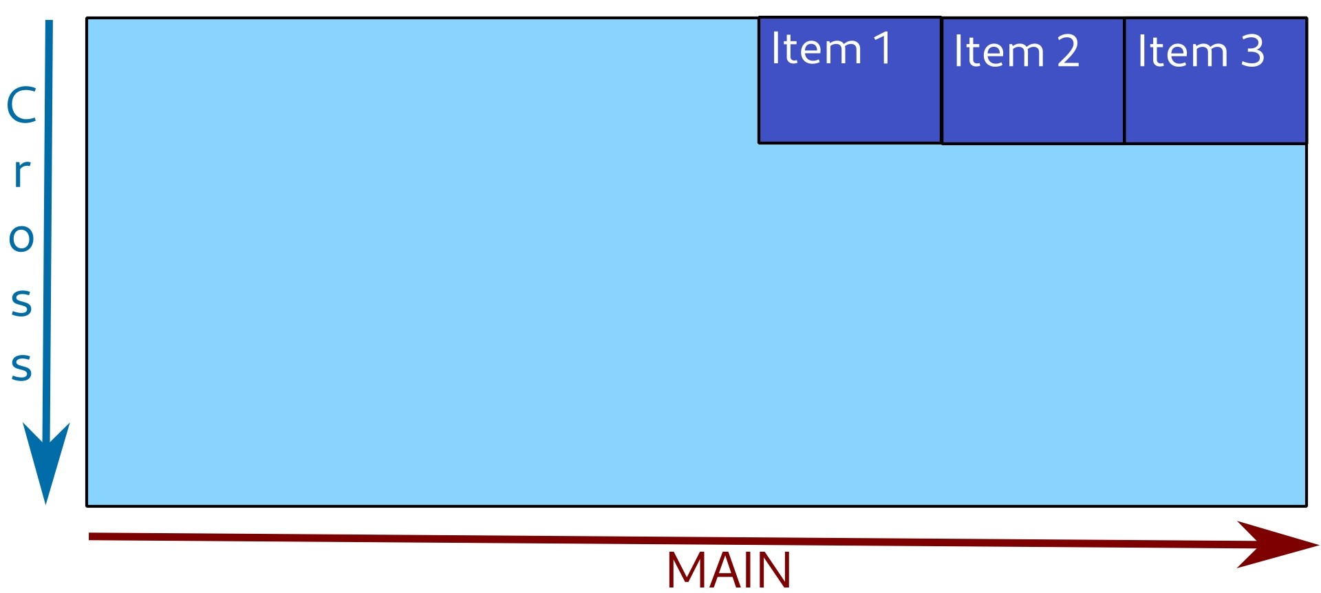
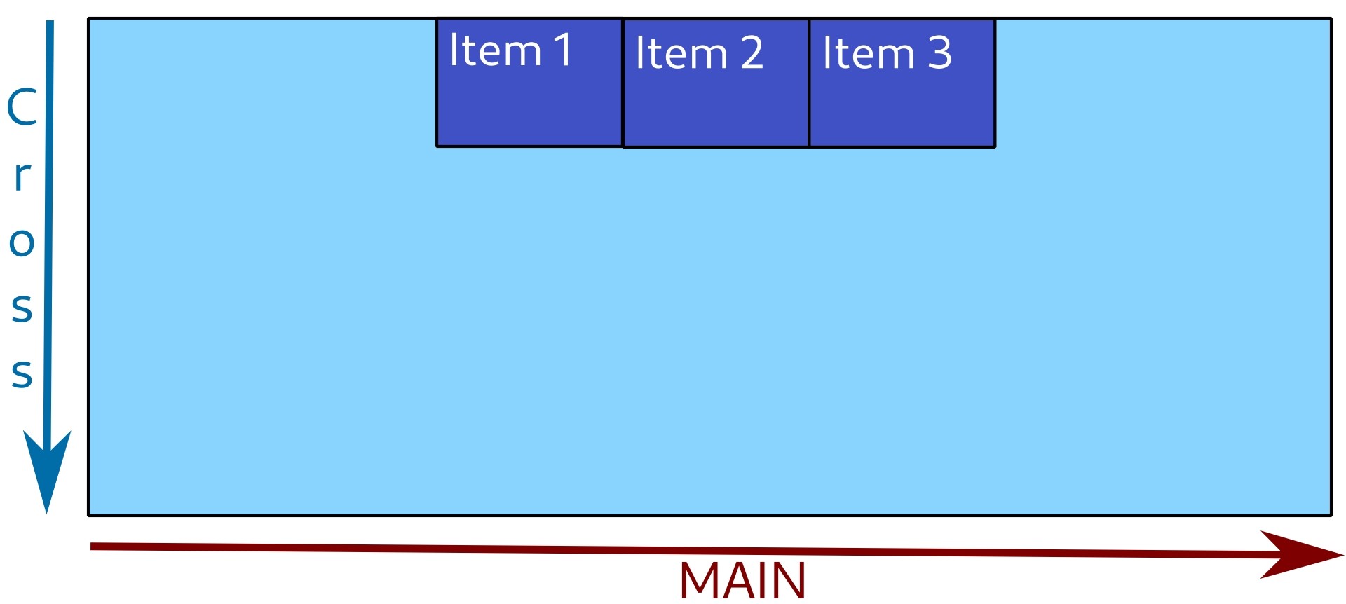
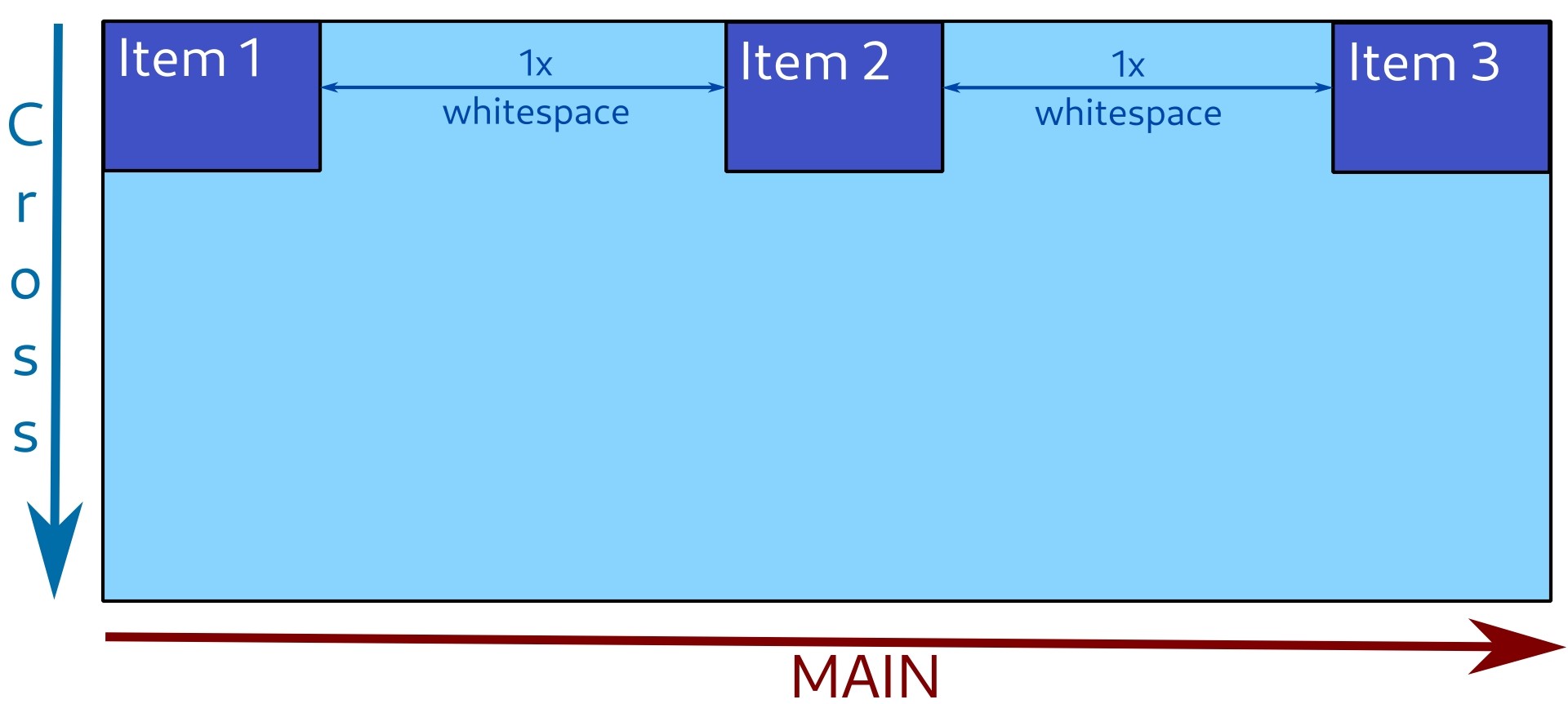
}Justify-content
div {
  display: flex;
  justify-content: space-between;
}
Position items along main axis.
Possible values: flex-start, flex-end, center, space-between, space-around, space-evenly.
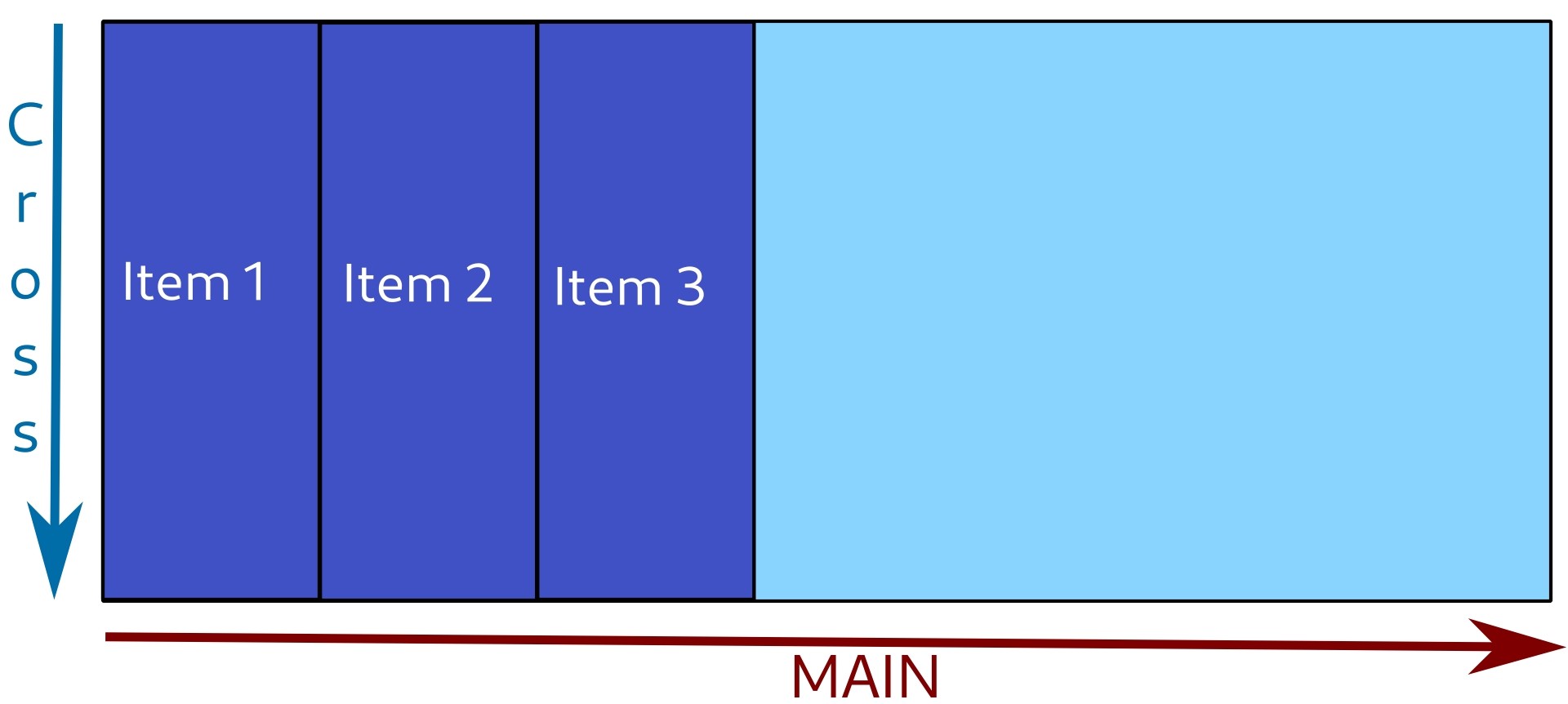
Flex-start (default)
Flex-end
Center
Space-between
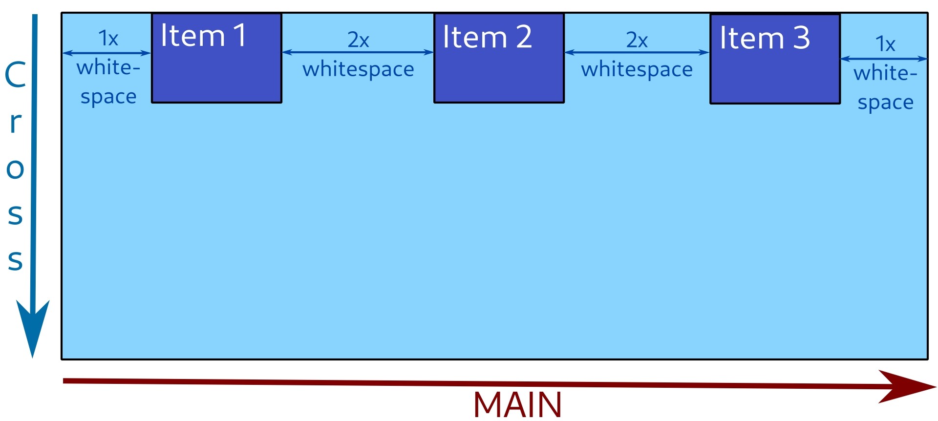
Space-around
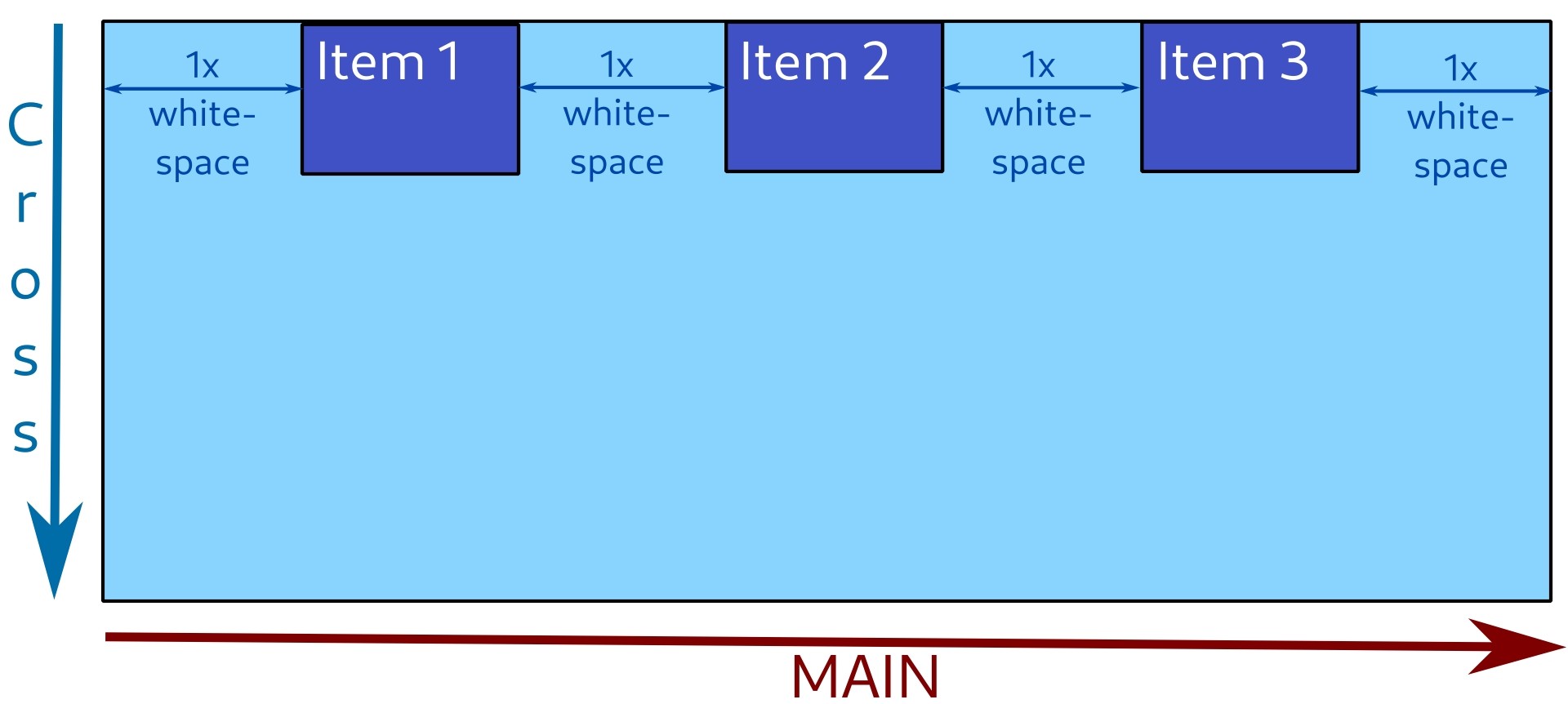
Space-evenly
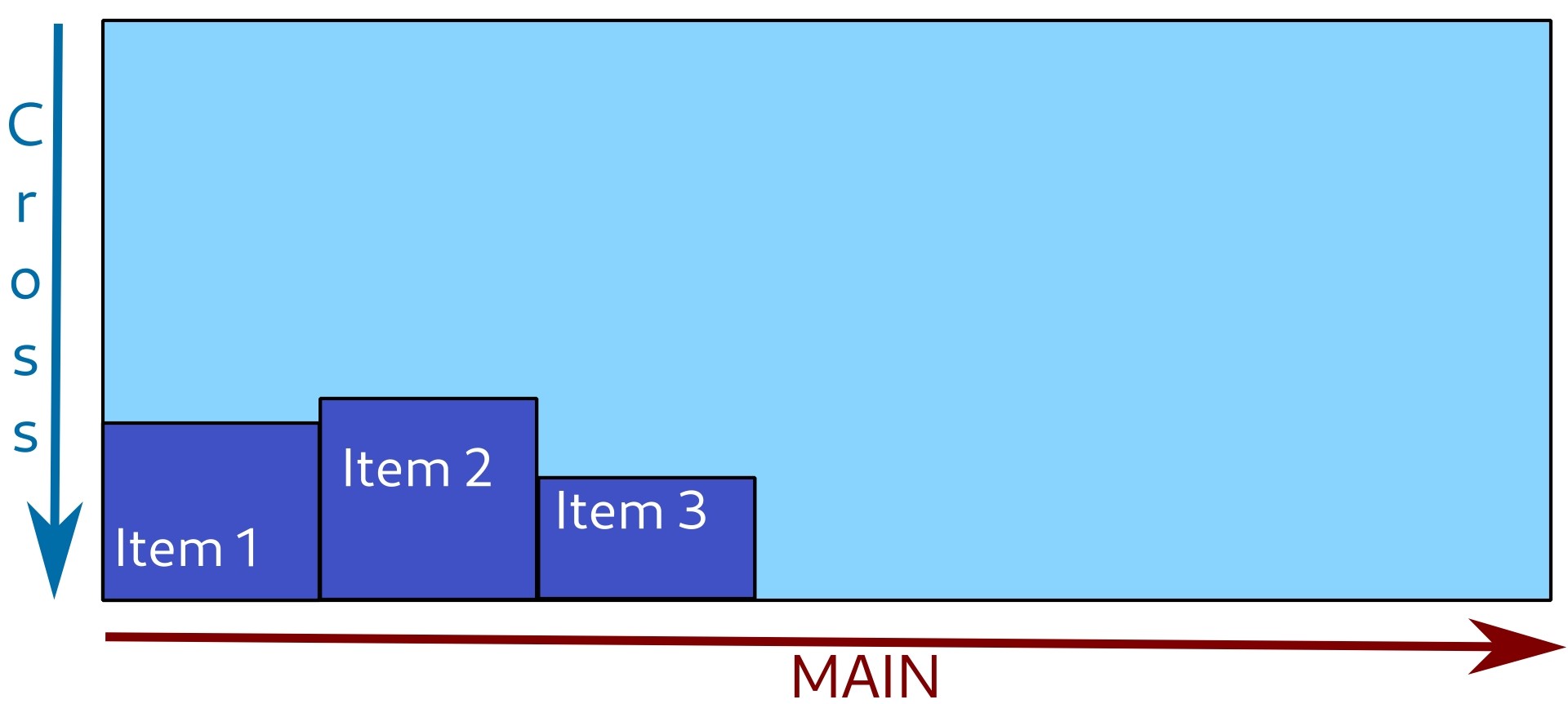
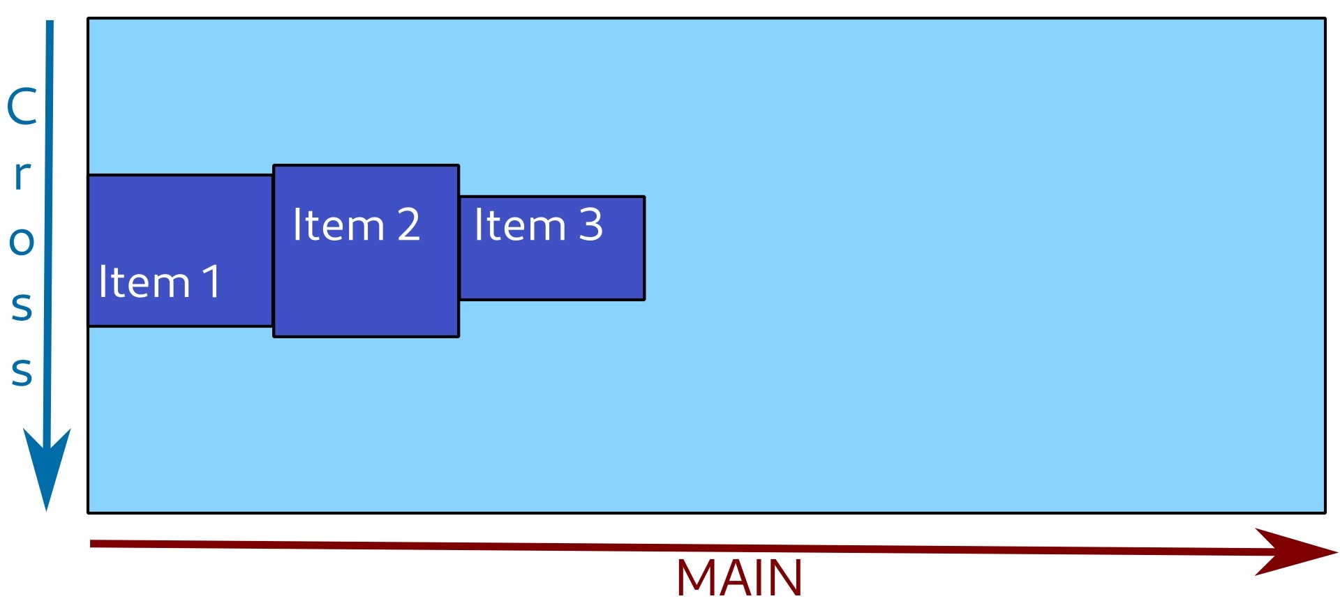
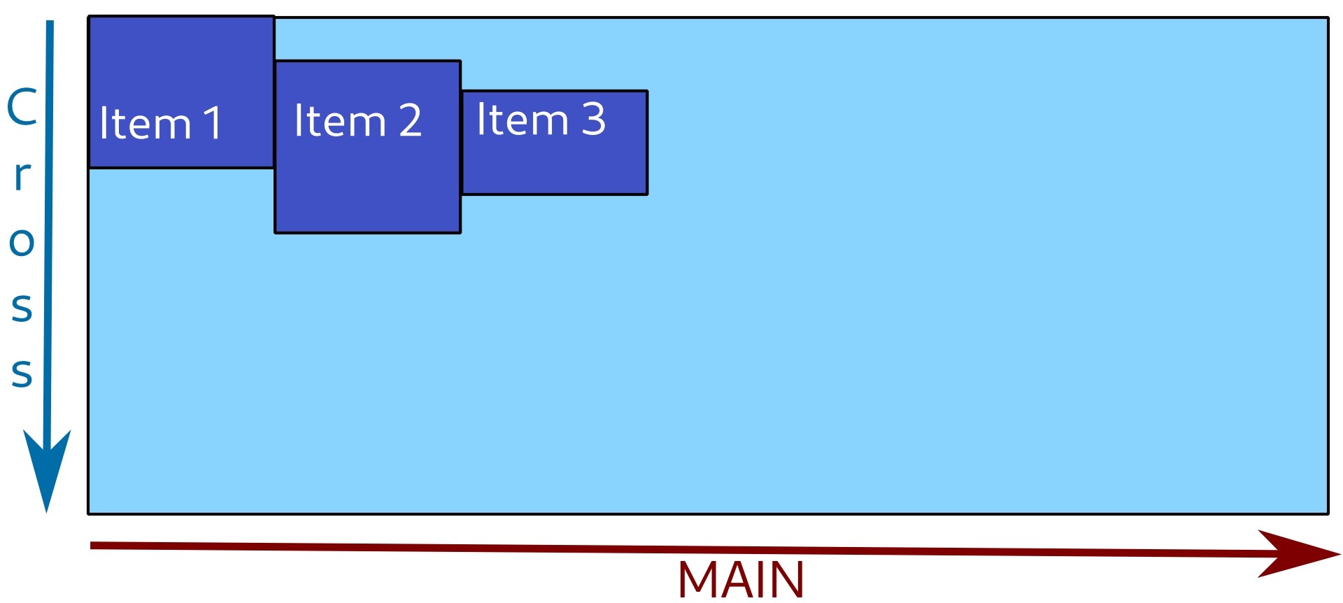
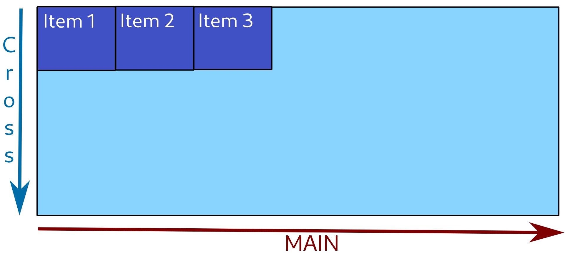
Align-items
div {
  display: flex;
  align-items: center;
}
Position items along cross axis.
Possible values: normal/stretch, flex-start, flex-end, center, baseline.
Normal/stretch (default)
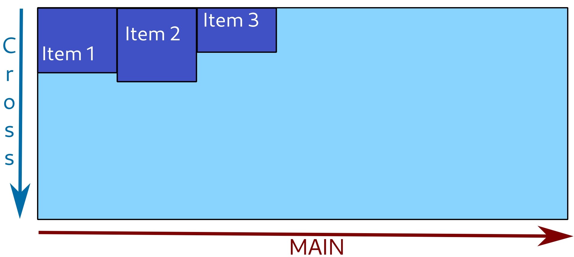
Flex-start
Flex-end
Center
Baseline
Flex-direction
div {
  display: flex;
  flex-direction: column;
}
Set direction of main axis.
Possible values: row, row-reverse, column, column-reverse.
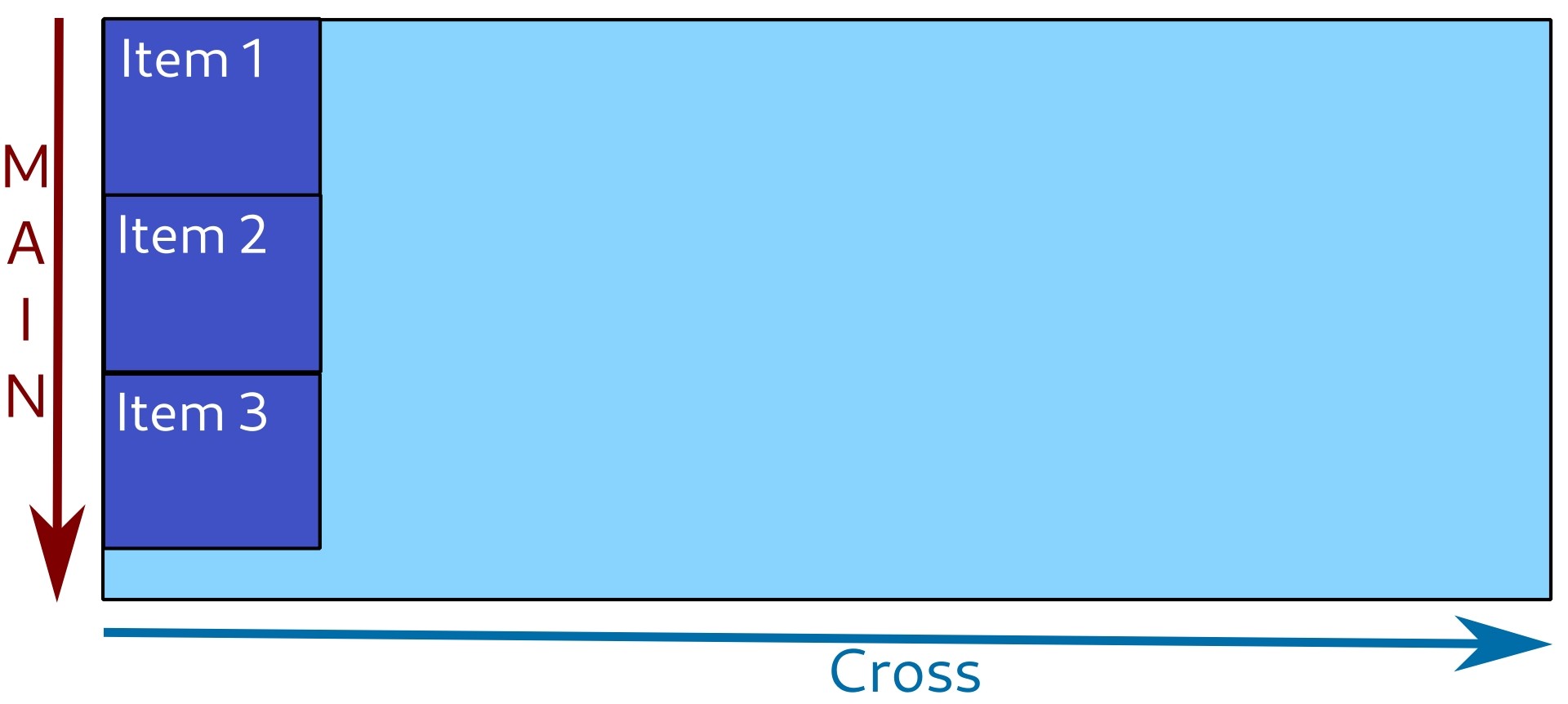
Row (default)
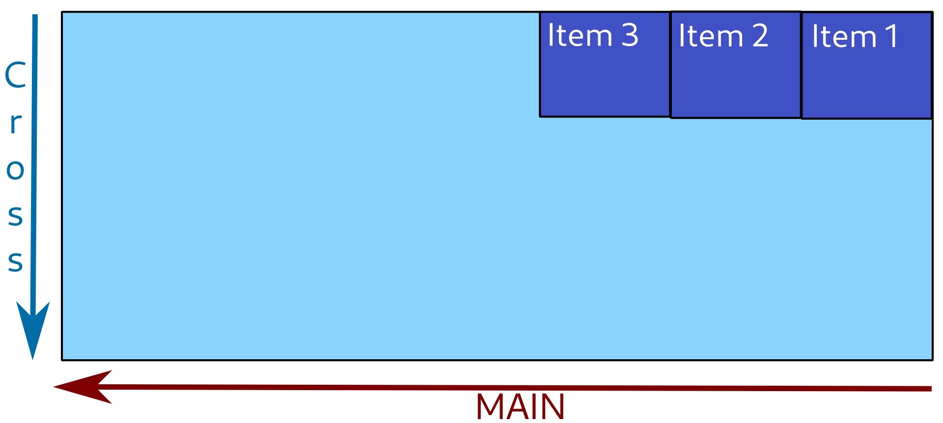
Row-reverse
Column
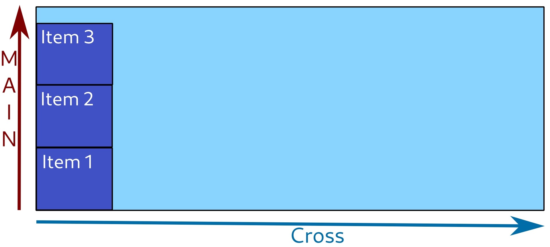
Column-reverse
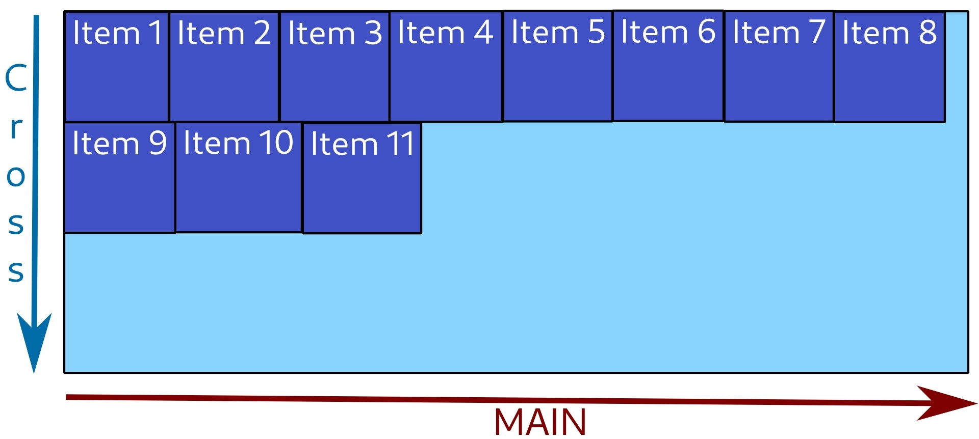
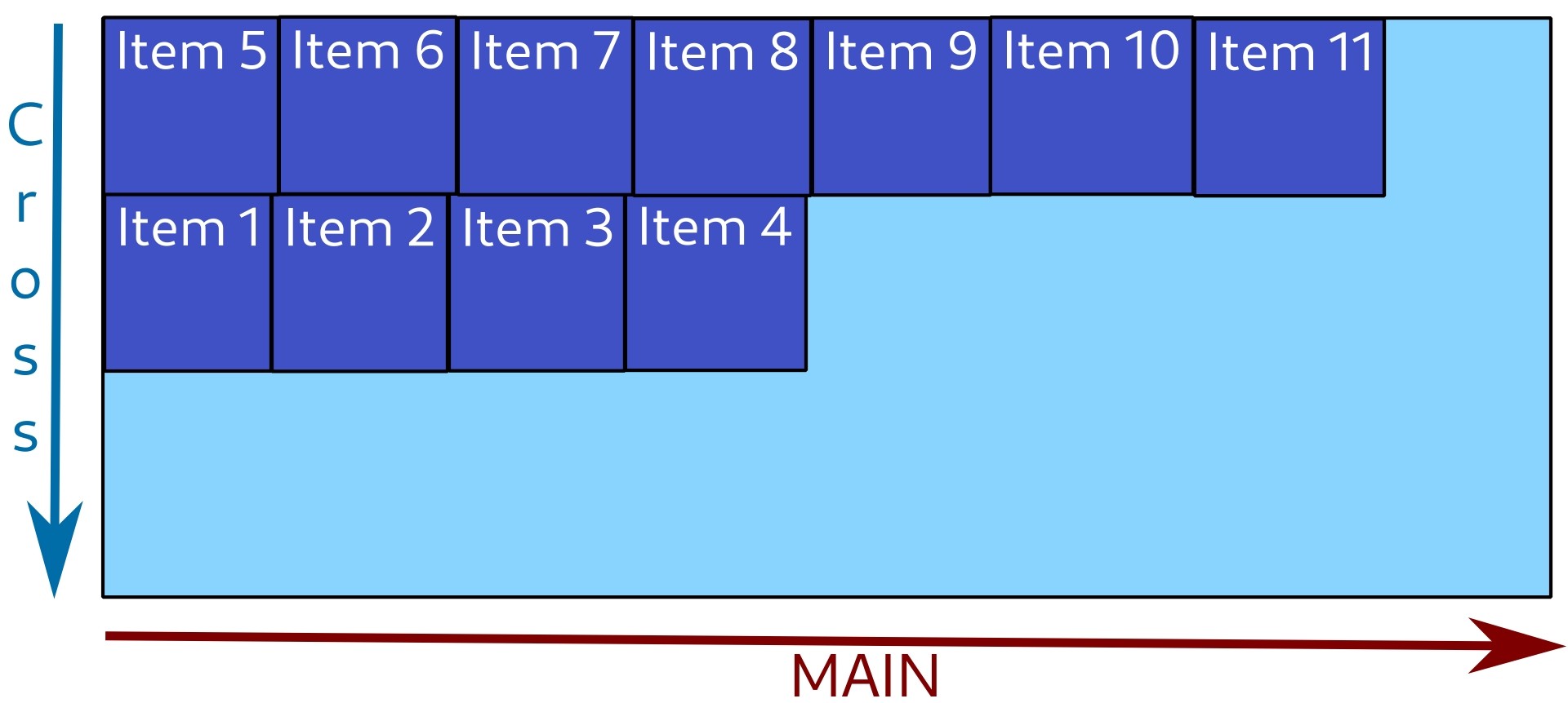
Flex-wrap
div {
  display: flex;
  flex-wrap: wrap;
}
Set whether items should be wrapped into a new line or not, if can't fit all of them into one.
Possible values: nowrap, wrap, wrap-reverse.
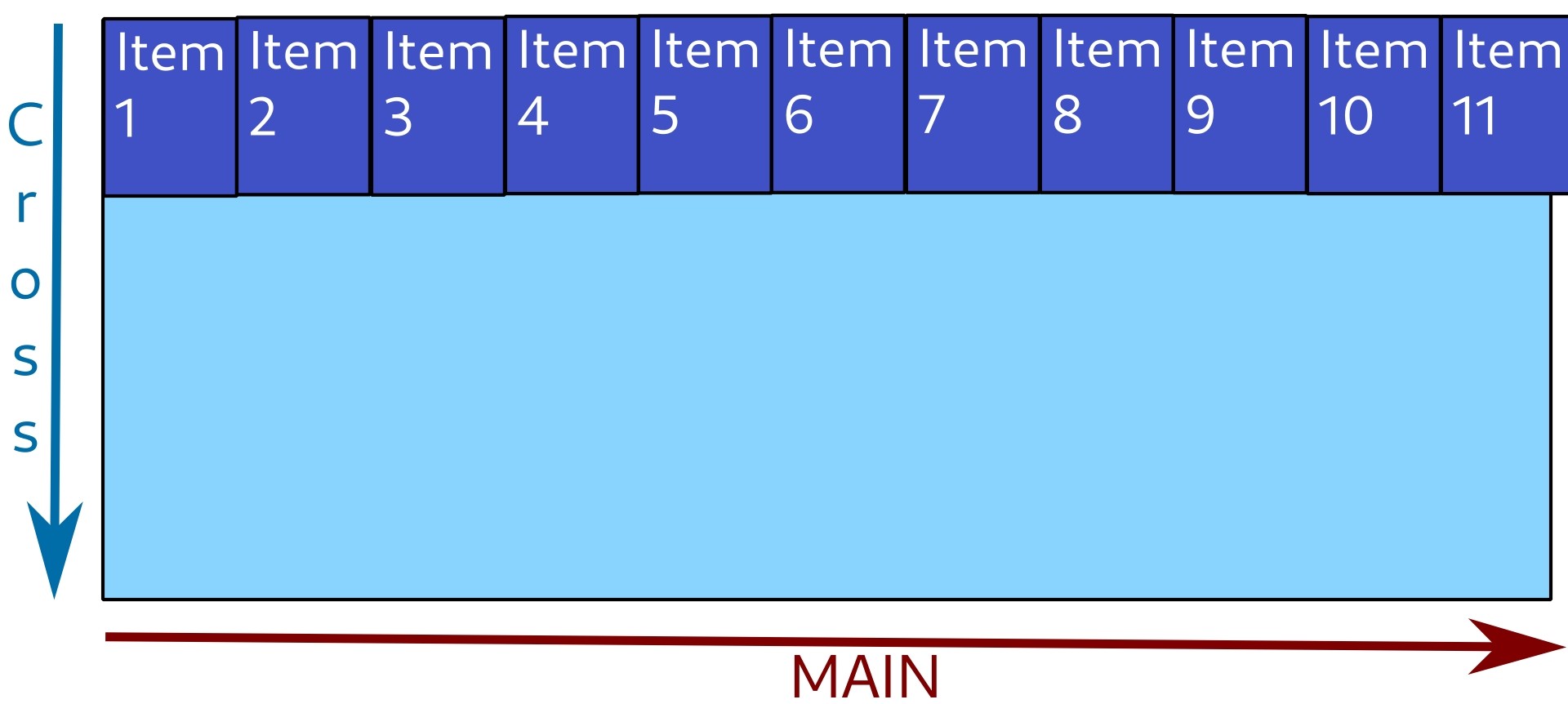
Nowrap (default)
Wrap
Wrap-reverse
Flex-grow
div {
  display: flex;
}

div .flex-item {
  flex-grow: 2;
}
A property for flex item to set how much it can grow compared to other items.
It can have any (zero or positive) number as value. Default value is 0.
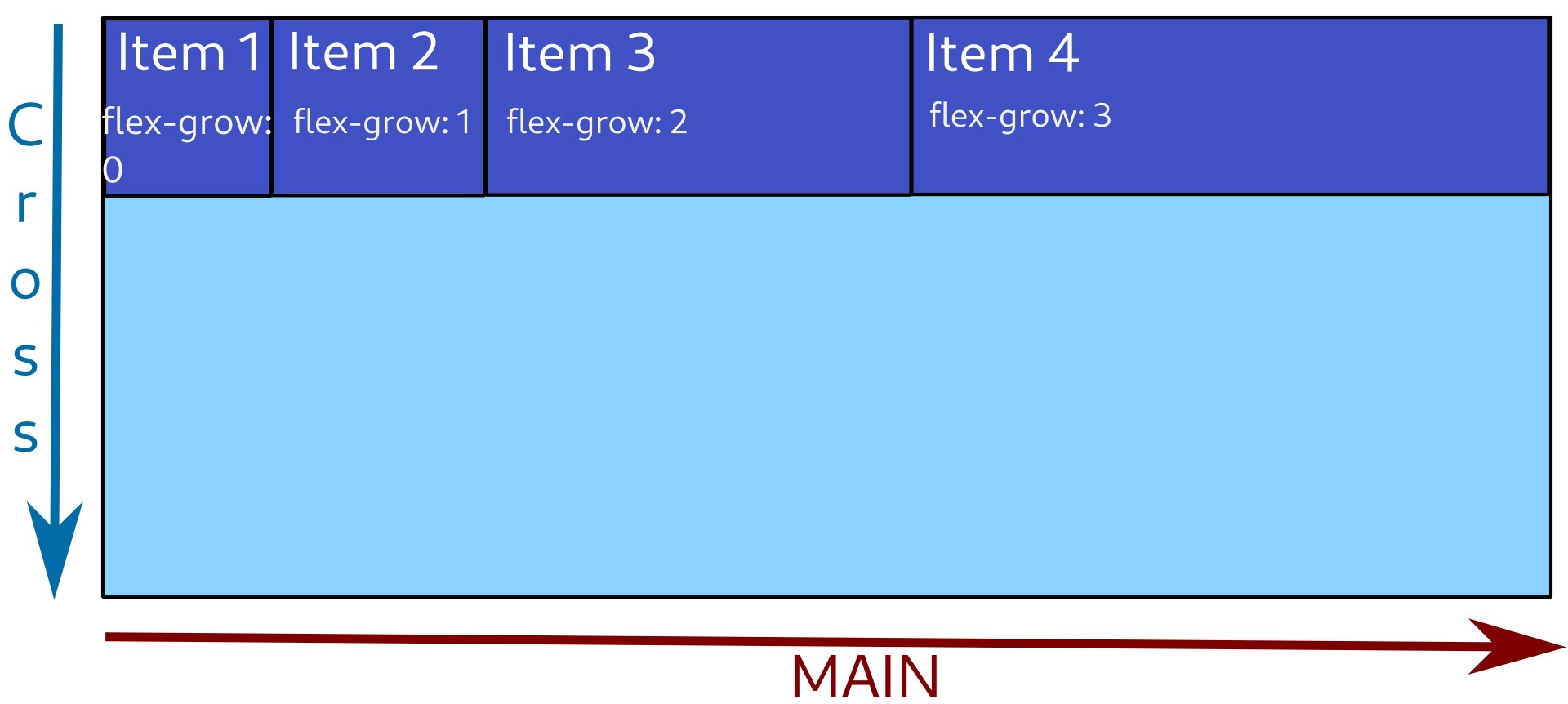
(First item takes the width of its content, third is twice as big as second, fourth is three times as big.)